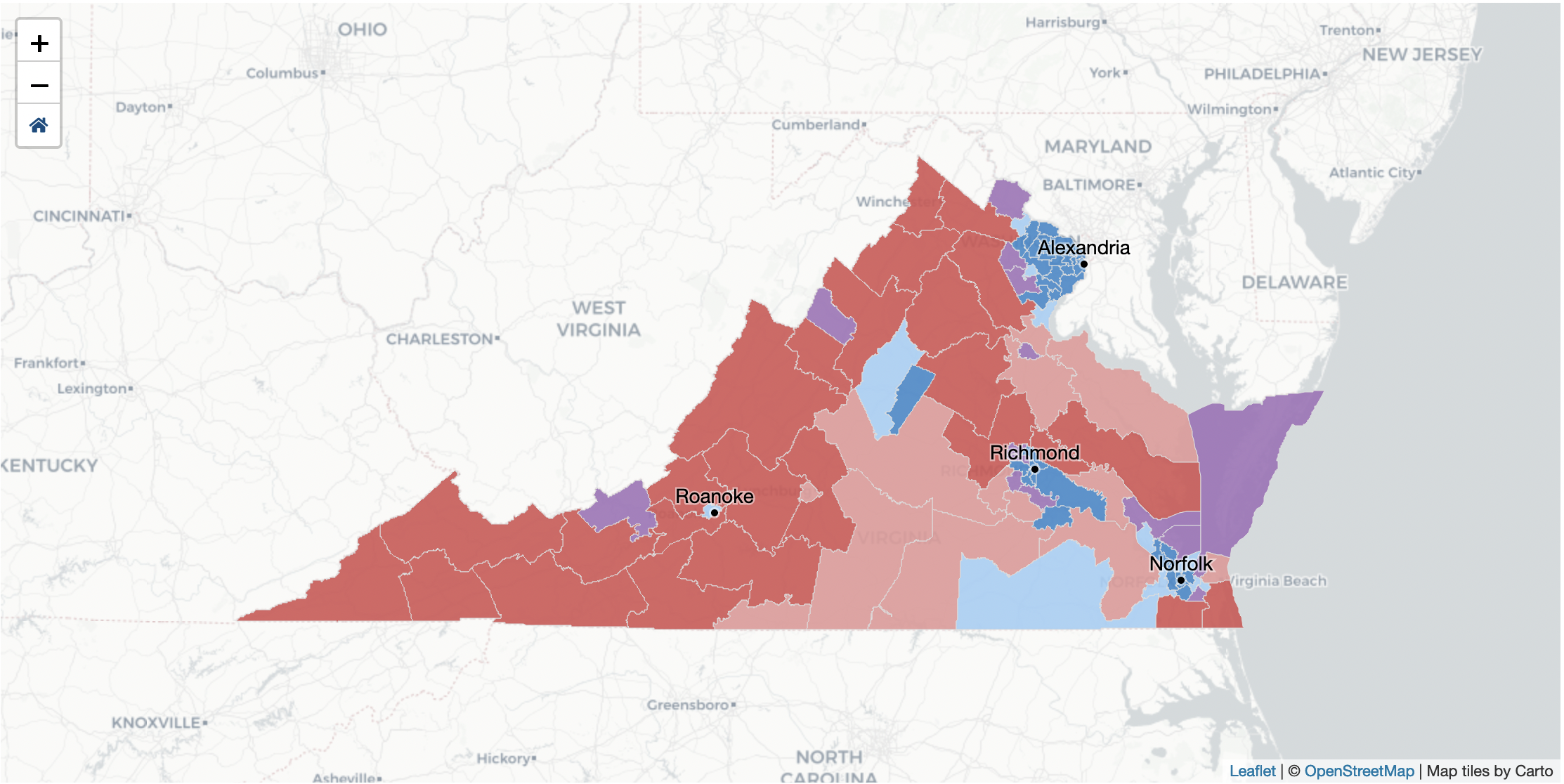
One of the big projects we tackled at VPAP in 2020 is Virginia's redistricting process. With a Redistricting Commission in charge of trying to create new districts, we've been able to visualize and help people make sense of draft plans. I built the front-end code for the maps and charts in this multi-page web application.
Python

In 2020, The Virginia GOP decided to run a multi-round, ranked-choice election where delegates' votes were weighted based on where they lived. Despite having only a week to design and build the pages, we created a live election results page. I built the front-end code in d3 and Svelte, as well as much of the server-side code in Django.
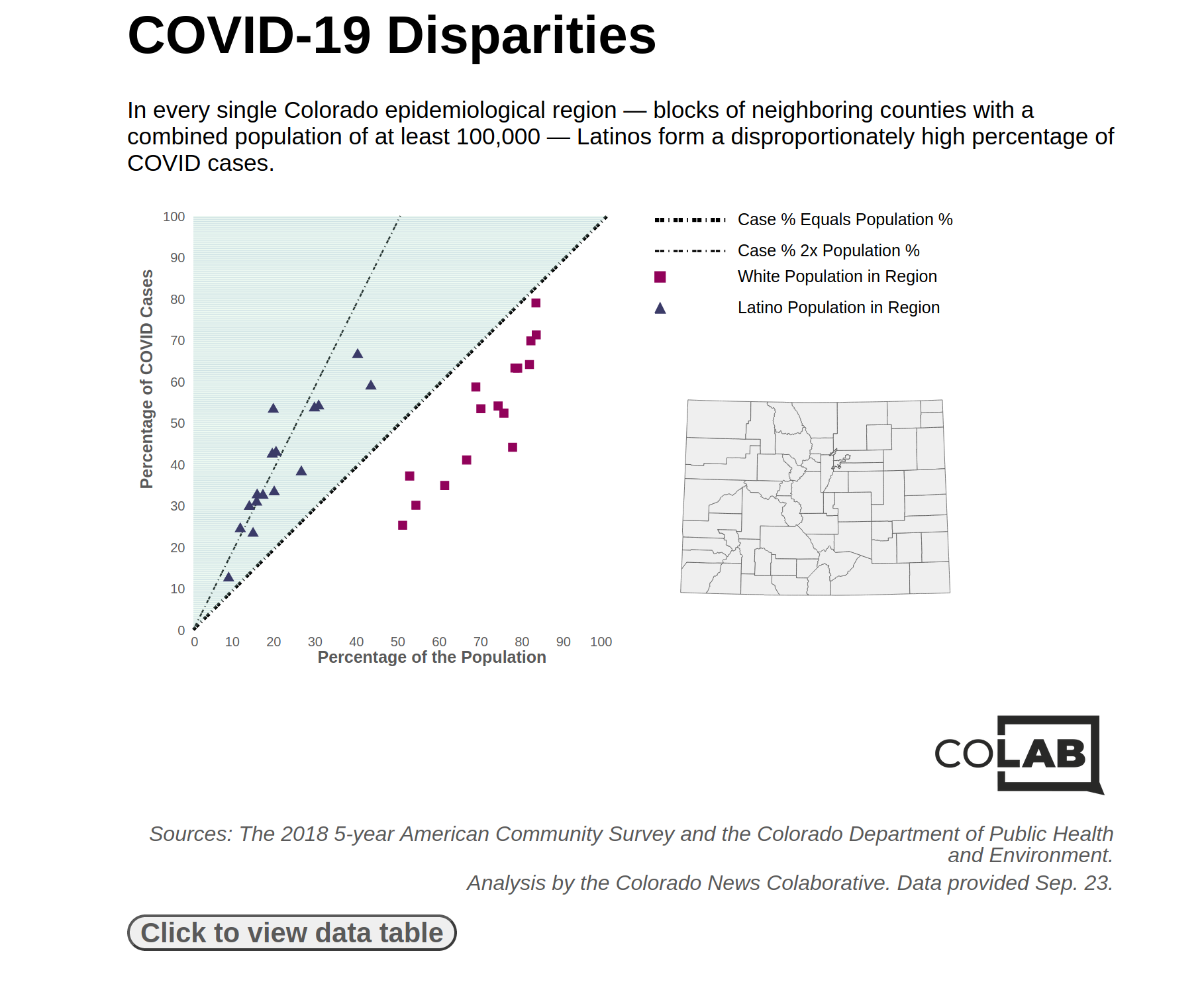
I conducted an analysis and reported most of the interviews for a story showing that Latinos formed a disproportionate rate of COVID-19 cases in every region of Colorado. I also built a graphic displaying the results, using Svelte and a tiny bit of d3.
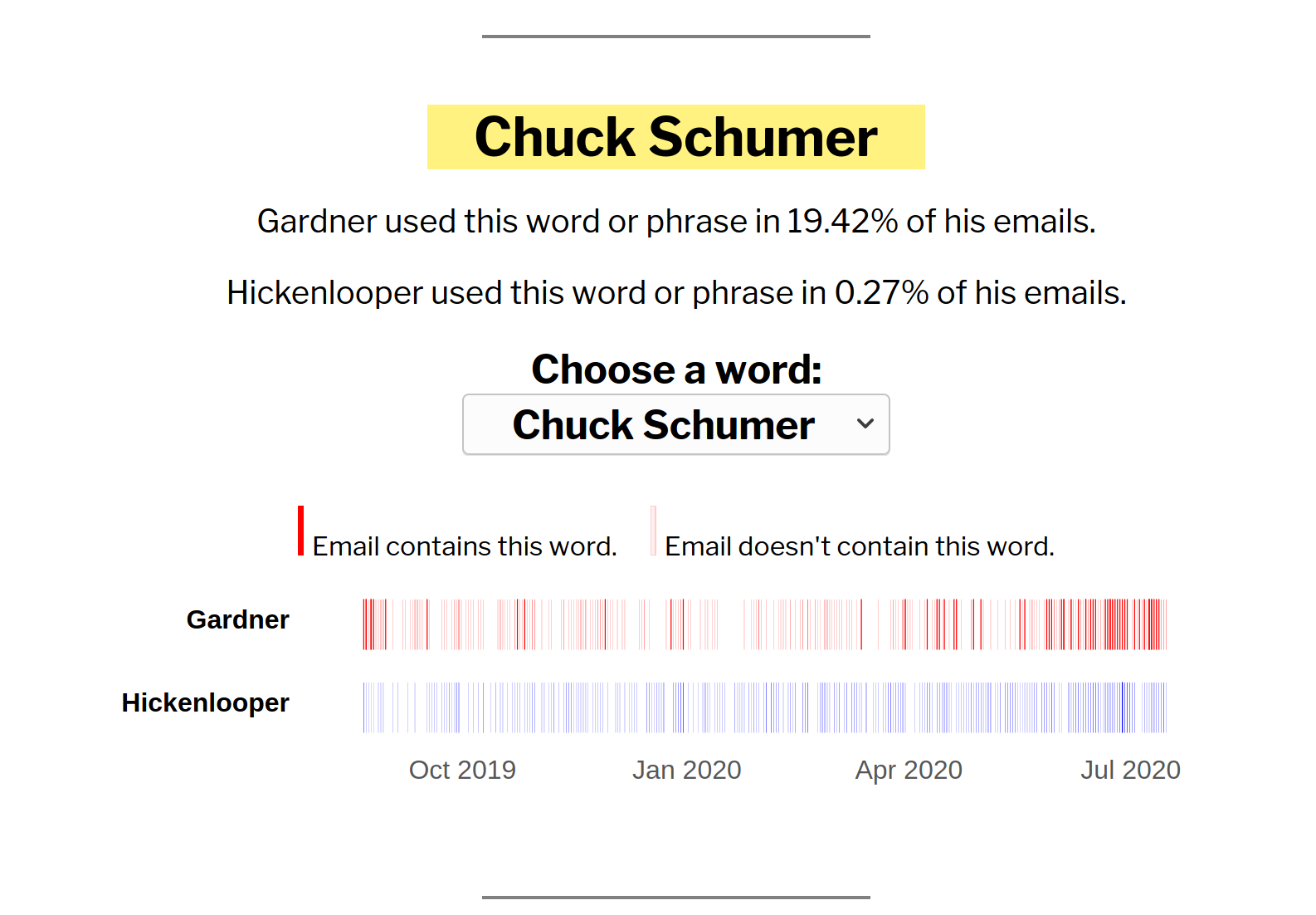
I conducted an analysis and wrote a story about how Senate candidates John Hickenlooper and Cory Gardner used more partisan language in their emails than they did in their campaigns. The pattern is a common feature of campaign emails, which are geared toward a partisan base.
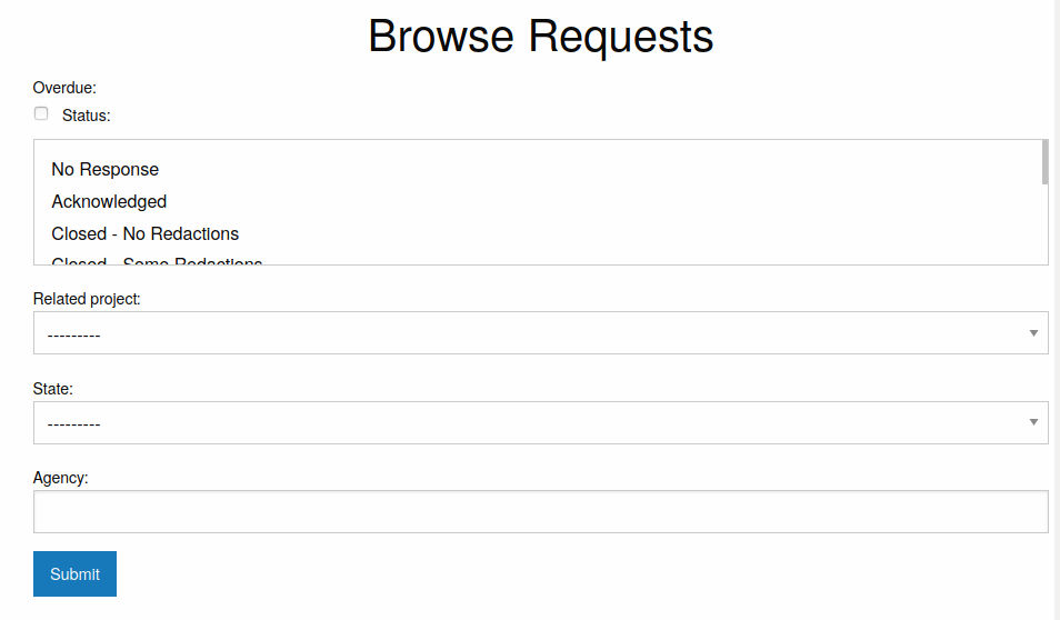
For my master's thesis in Stanford's journalism program, I'm working on a project that involves getting records from a lot of different municipalities.
For data journalists, this is a pretty common problem. A lot of information journalists seek — death records, inspection records, you name it — is collected at the state, county, or municipal level. And data journalists often want to analyze that information across a wide geographic area.
In order to manage this work, I created a Django tool for filing public records requests to multiple agencies at once. I used an early version of this, django_sourcebook, to file requests for a reporting project. Since then, I've worked on building a more interactive version with authentication and tests. That project is foia_integration.
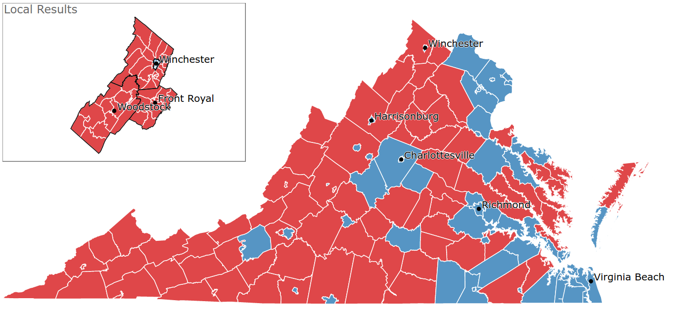
I wrote the front-end and back-end code to display precinct-level election results for northwest Virginia during the 2018 midterms.
As part of this process, I requested precinct shapefiles from 27 localities in Virginia; cleaned and joined the shapefiles using PostgreSQL and PostGIS; wrote code in Python to scrape the results and push them to an AWS S3 bucket; and wrote front-end code in d3 to display the results. I additionally set up an EC2 instance and ran the Python script from there so the script could continue running even if something happened to my computer locally.
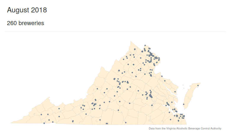
In a one-year period, Strasburg, Virginia — a town of 6,000 people — saw two new breweries come in. A nearby town, Front Royal, also had a new brewery come in that year. I wanted to see what got the owners to start their breweries and why Virginia as a whole had seen such a large spike in the number of new craft breweries.
I interviewed people at two of the three new breweries in our region, helping me identify a new law that helped one of them come into existence. I also conducted some analysis in Python and built a visualization in d3 to demonstrate how fast the growth had been.
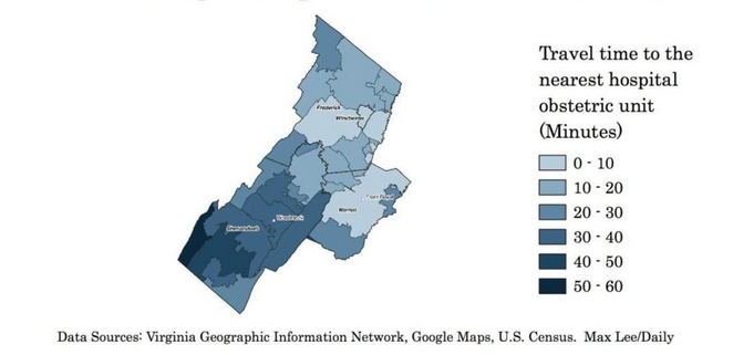
After our local hospital system announced it was cutting obstetric services from one of its hospitals, I wanted to know what impact the decision would have on the amount of time women would have to spend traveling to deliver a baby. I calculated the travel times to the nearest obstetric unit from each ZIP code in our region using Google Maps's API in Python and mapped the results using QGIS.
The change, I found, would mean that more women in our region would have to drive long distances -- with some having to travel close to an hour -- to deliver a baby at a hospital with a devoted obstetric unit.
